
Search is the front door
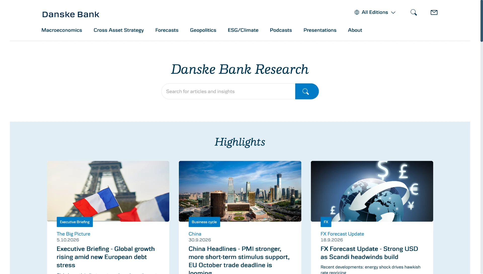
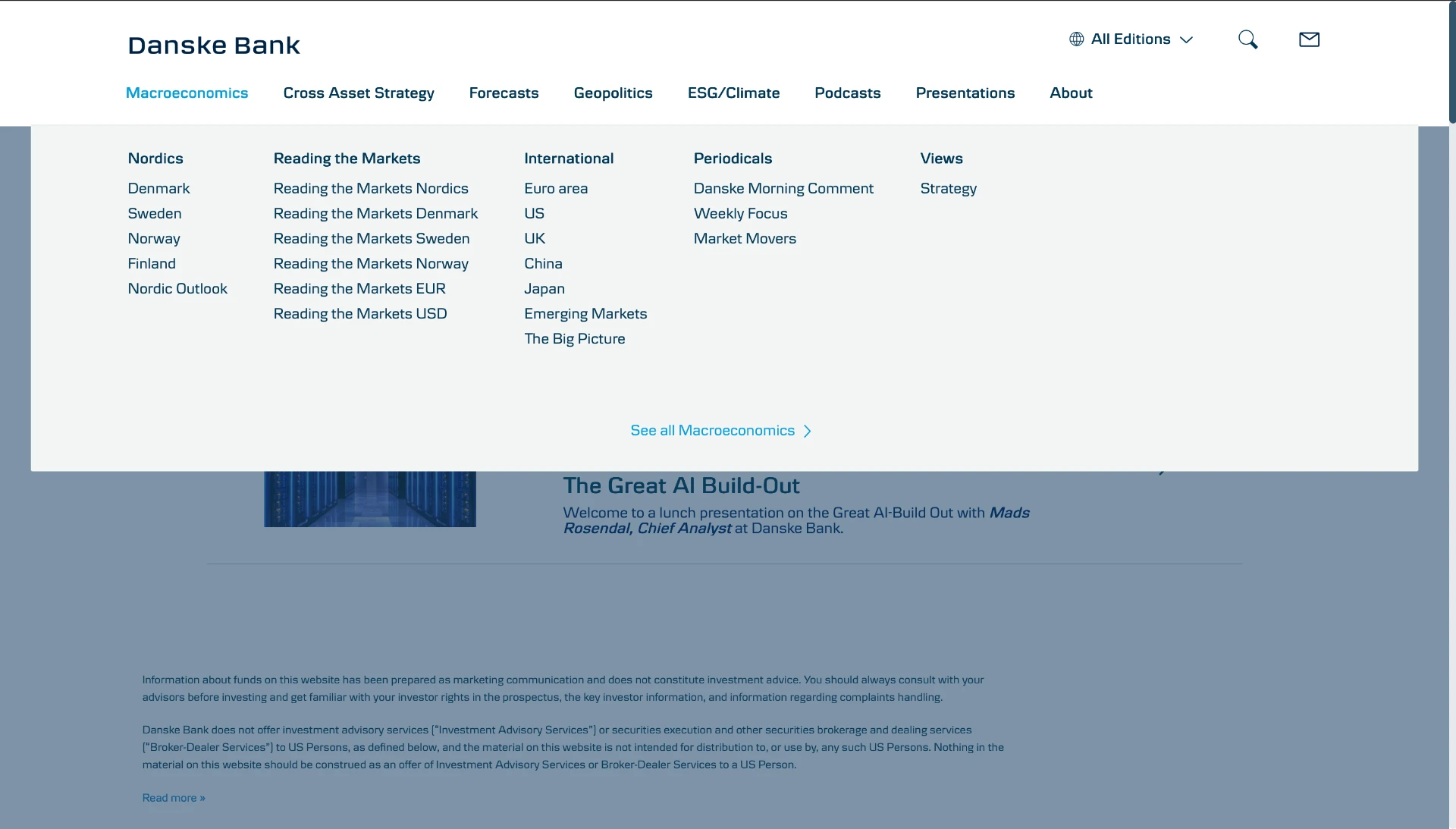
Search logs showed nobody browsed — everyone searched. Retrieval became the primary architecture, with filters for topic, date, and team instead of a folder tree.
Case study
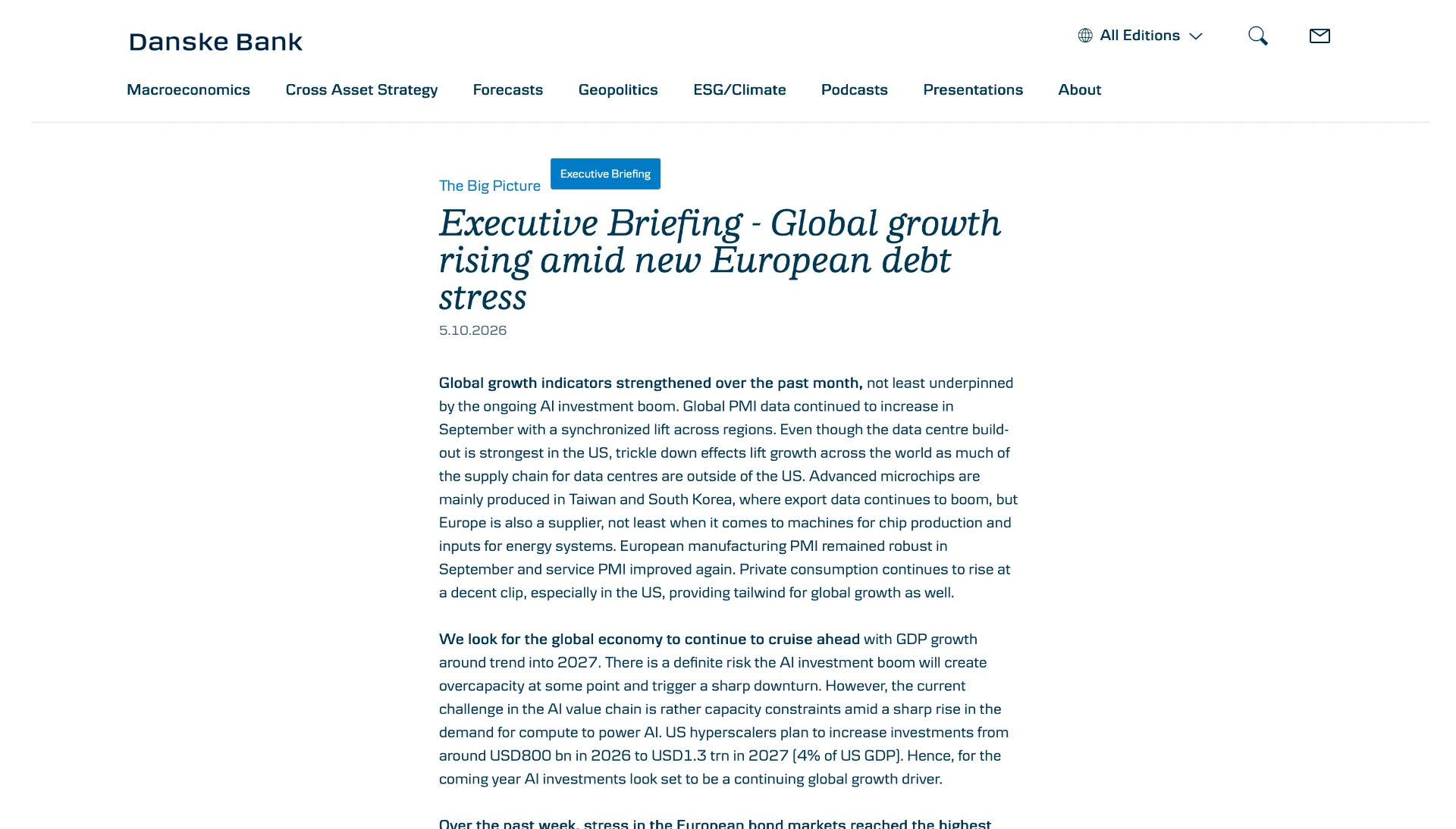
A 100% digital onboarding research portal for Denmark's largest bank.
01
Start with the reader’s needs, define the right problem, explore alternatives, then validate the experience.
Reconstructed UX framework for this portfolio story. The activities below describe a research and validation plan, not verified sessions or original research artifacts.
01 · Explore broadly
Listen to readers, audit the research catalogue and map discovery, reading and subscription journeys.
Research questions · journey map
02 · Focus the problem
Synthesize observations into a clear problem, navigation priorities and explicit criteria for successful tasks.
Problem statement · test criteria
03 · Explore alternatives
Compare low-fidelity options for search, category navigation, article hierarchy and subscription selection.
Wireframes · testable prototype
04 · Validate and refine
Test the prototype with representative readers, prioritize observed issues and review accessibility before handoff.
Validation log · refined interface
How do readers find relevant research, and where does their journey break down?
Planned artifact: Interview guide and a discovery journey map
Do topic names and navigation groups match the way readers look for research?
Planned artifact: Content inventory, proposed taxonomy and tree-test tasks
Can readers judge relevance, read an article and choose the right subscription?
Planned artifact: Task-based prototype test plan and an issue log
02
A central place for Danske's research community to publish, browse, and trace the lineage of every study informing a product decision. Built to be skim-able for execs and rigorous for researchers.
Team: 2 designers · 4 engineers · 1 researcher
03
Research was scattered across Confluence, drives, and inboxes. Findings repeated themselves because nobody could find what already existed. We needed a hub with shape, not a folder.
How might teams find a relevant study quickly and trace a finding back to its evidence before making a product decision?
04
Interviewed 18 researchers and 7 PMs to understand how findings actually travel through the org.
Modeled research as a graph — studies, insights, decisions — instead of a flat list.
Designed for two audiences in one shell: scanners and readers.
Established editorial guardrails so the hub stayed scannable as it scaled.
05
Search logs showed nobody browsed — everyone searched. Retrieval became the primary architecture, with filters for topic, date, and team instead of a folder tree.
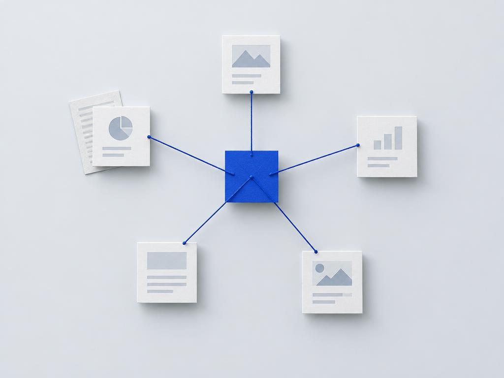
Studies, insights, and decisions were modelled as linked nodes. Every finding carries its lineage, so a claim can always be traced back to its evidence.

Executives skim 30-second summaries while researchers read full reports. One product serves both through layered depth instead of splitting into two tools.
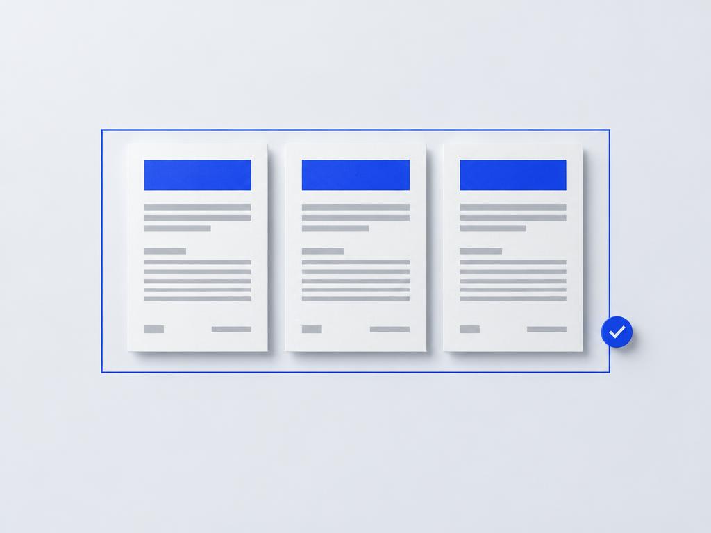
Templates and publishing standards keep the hub scannable as it scales — structure is enforced by the system, not by discipline.
Conceptual illustrations, not product screenshots or research artifacts.
06
07
The hardest part of this project was not the interface — it was agreeing on what a "finding" is. Modelling research as a connected graph forced every team to confront how their work actually travels through the organisation, and that shared model did more for reuse than any screen we shipped.
If I ran it again, I would bring engineering into the taxonomy workshops earlier. The domain model we designed in week six was almost exactly the one we shipped — the weeks in between were spent translating intent that could have been co-authored from day one.
08

Vijay.
Loading