Aditya Birla Pivot / 2024
Aditya Birla Pivot — Website
Editorial marketing site for a steel-tech B2B platform. Built for storytelling, optimised for conversion.
Marketing site · Editorial
Aditya Birla Pivot — Website
Editorial marketing site for a steel-tech B2B platform. Built for storytelling, optimised for conversion.
Client
Aditya Birla Pivot
Role
Lead Designer
Timeline
4 months · 2024
Platform
Marketing site · Editorial
Context
Steel is not glamorous. So we made the site about the people, the process and the proof — an editorial spine with conversion engineered into every chapter.
Industrial B2B sites typically read like brochures. We wanted Pivot's site to feel like a publication — credible enough for procurement, sharp enough for the trade press.
Research approach
Understanding the people and workflow behind the brief.
Methods
- Buyer interviews
- Competitive teardown
- Message testing
- Heatmap analysis (v0)
Participants
9 procurement buyers · 5 sales leads · 3 industry analysts
Duration
3 weeks discovery + 2 rounds of message testing
Research storyboard

The buying committee
Procurement heads, analysts and sales described what actually earns a quote request.

Proof over polish
Card sorting reframed the structure around named customers and evidence.

One quiet CTA
Layout studies placed a persistent, low-key quote path on every scroll depth.

A/B and budget
Copy and placement tested in rounds while holding a 97 Lighthouse budget.
Illustrative scenes, not photographs from the original research.
Proposed follow-up survey
A framework for future validation, not reported survey findings: ask about workflow frequency, confidence in the information, the most difficult step, and what would make the task easier.
What emerged
Finding 01
Proof outperforms polish
Named customers and case-study snippets beat every stock hero photo in preference tests.
Finding 02
Quotes want to be quiet
A persistent, low-key CTA converted better than any hero button in A/B rounds.
Finding 03
Analysts amplify
Design the press page like a product — analysts became a repeatable inbound channel.
Defining the problem
Problem statement
How might procurement buyers understand Aditya Birla Pivot’s offering and find credible proof before requesting a quote?
Design priorities
- Anchored every section in a real story — customers, factories, supply chains.
- Built a modular editorial grid so the marketing team could publish without designer-in-the-loop.
- Designed conversion as a quiet through-line: 'request a quote' followed the reader, never shouted.
- Engineered for performance — 95+ Lighthouse on every page, no exceptions.
From research to design
Listen to the buying committee
Spoke to procurement heads, analysts and the sales team to learn what actually earns a quote request.
Stakeholder interviews · Competitive teardown · Analyst input
Proof over polish
Positioned the site around named customers and evidence rather than category adjectives.
Messaging hierarchy · Preference testing · Narrative outline
One quiet CTA everywhere
Built the page architecture around a persistent, low-key quote path instead of a hero button.
Sitemap · Content model · Conversion mapping
Editorial layouts
Explored magazine-style section rhythms that let proof points breathe on scroll.
Wireframes · Layout studies · Motion notes
A/B and performance
Tested CTA placement and copy in rounds while holding a 97 Lighthouse performance budget.
A/B testing · Performance budget · Analytics review
Low-fidelity exploration · schematic reconstruction
Structure before visual design
These simplified layouts illustrate the information hierarchy and task sequence; they are not original research artifacts.
Testing & evidence
Design decisions were reviewed against the research themes and the workflow priorities above. Further measurement is needed to establish a reliable before-and-after comparison.
Outcome
The final interface
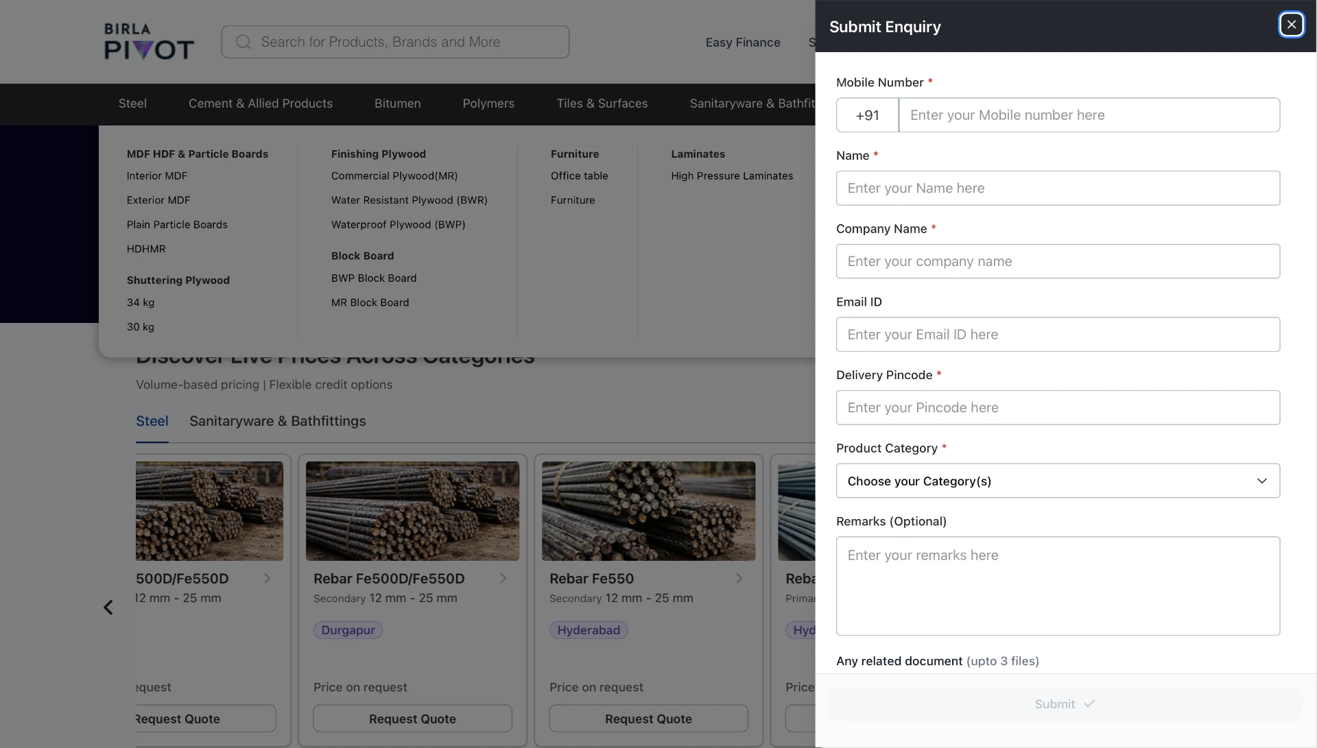
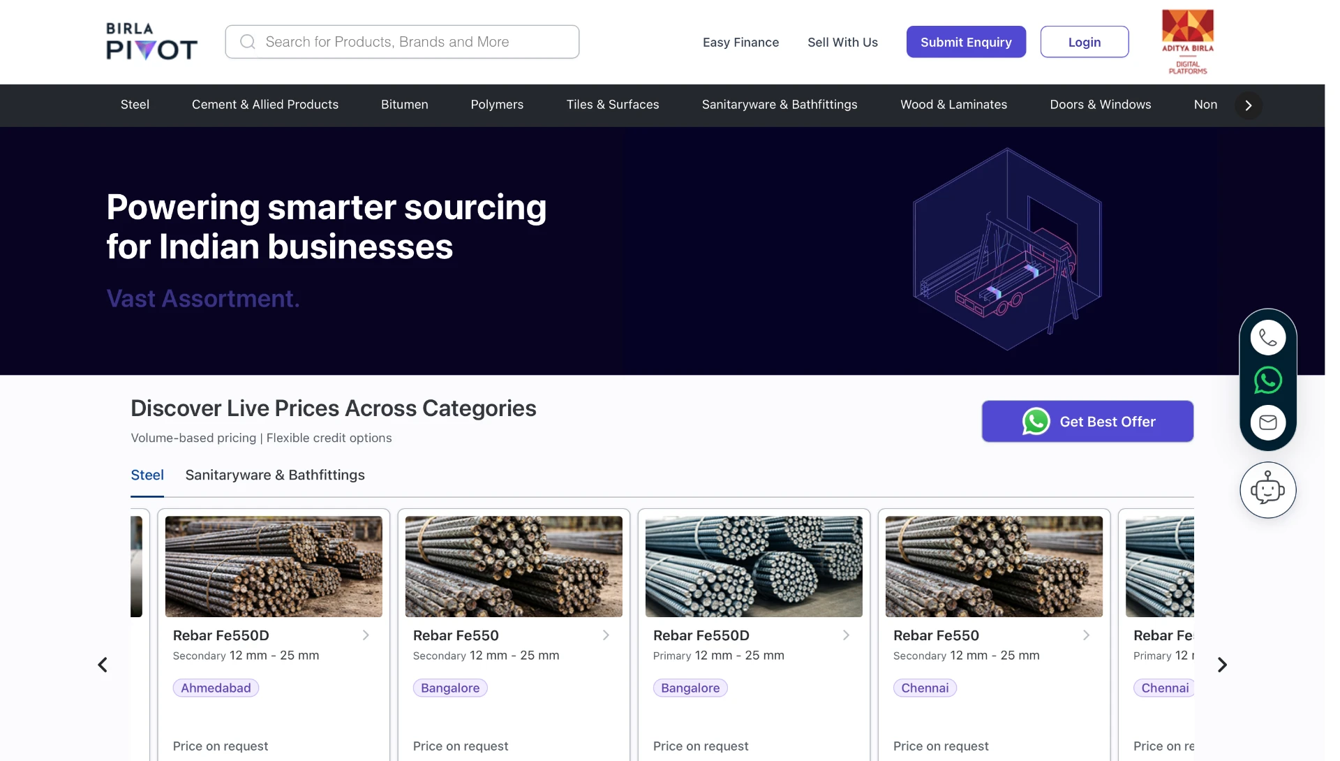
Four views from the live Birla Pivot website, from product discovery to enquiry.
01
Discover live prices
The homepage connects the sourcing proposition with product cards, location context and a direct quote path.
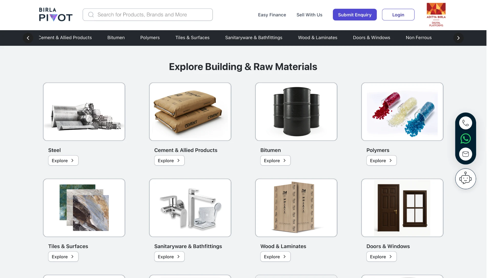
02
Explore materials
A visual category grid helps buyers scan building and raw materials before narrowing their search.
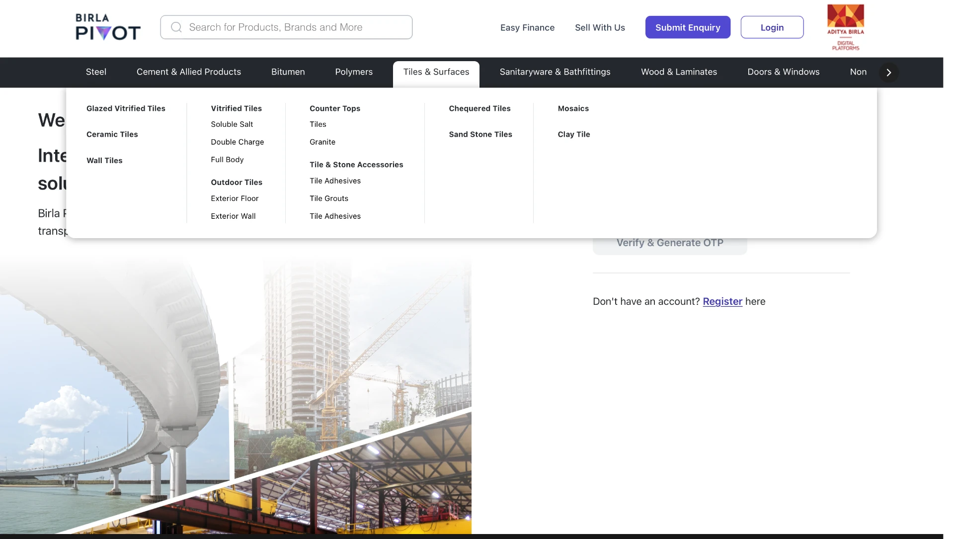
03
Navigate the catalogue
The category menu exposes product families and subcategories in one view.
04
Submit an enquiry
The enquiry panel collects the buyer’s product category, delivery location and contact details.