Global Fair / 2023
Globalfair Design System
Tokens, primitives, and patterns that scaled across 4 product lines and 60+ engineers.
Figma · React · Documentation site
Globalfair Design System
Tokens, primitives, and patterns that scaled across 4 product lines and 60+ engineers.
Client
Global Fair
Role
Design System Lead
Timeline
11 months · 2023
Platform
Figma · React · Documentation site
Context
Design system / introduction
From elements to experiences
Atomic design is a way to understand how small interface decisions become complete product experiences. In this study, the supplied palette, elevation rules, buttons, inputs, date picker and upload states show the foundations and components; the later layers describe how those pieces can be composed, not additional artifacts shown here.
- 01AtomsColor, type, spacing and basic controls
- 02MoleculesControls combined into useful patterns
- 03OrganismsPatterns arranged into functional sections
- 04TemplatesA repeatable page structure
- 05PagesA real experience with content and states
Four product teams. Three accidental design languages. Globalfair DS unified them under one tokens layer — semantic, themable, and engineered so a button is a button is a button.
Every team had shipped their own primitives. Buttons varied by 4px of padding and seven shades of blue. We needed a system that respected speed without sacrificing coherence.
Research approach
Understanding the people and workflow behind the brief.
Methods
- Component audit
- Consumer interviews (devs + designers)
- Adoption pulse surveys
- Doc-site analytics
Participants
12 engineers · 6 designers · 3 PMs across 4 product lines
Duration
8 weeks audit + rolling adoption research
Research storyboard

Audit four products
Catalogued every component, token and one-off across the shipped surfaces.

Ask the builders
Engineers and designers described where the system helped and where they detoured.

Token architecture
Restructured colour, type and spacing into a layered, themable token model.

Adoption, tracked
Measured component coverage per release until the system became the default path.
Illustrative scenes, not photographs from the original research.
Proposed follow-up survey
A framework for future validation, not reported survey findings: ask about workflow frequency, confidence in the information, the most difficult step, and what would make the task easier.
What emerged
Finding 01
Docs are the product
Adoption rose sharply once docs shipped runnable code, not just anatomy diagrams.
Finding 02
Migration needs a partner
Embedded designer for two weeks unblocked more than any Loom could.
Finding 03
Semantic tokens win
Teams stopped asking for new colors once intent tokens (danger/success/info) existed.
Defining the problem
Problem statement
How might four product teams build consistently without slowing delivery or maintaining separate versions of the same interface patterns?
Design priorities
- Audited 1,200 components across four products; landed on 38 primitives that covered 92%.
- Defined semantic tokens (intent, surface, density) — never raw hex in components.
- Shipped docs as a product: live previews, copy-paste code, a11y notes, and migration guides.
- Embedded with each product team for two weeks during rollout to unblock in real time.
From research to design
Count everything
Catalogued 1,200 components across four products to see where the languages had drifted.
Component audit · Redundancy map · Colour/spacing inventory
38 primitives, 92% coverage
Set the scope line: the smallest primitive set that covers almost everything teams actually ship.
Coverage analysis · Scope contract · Naming conventions
Semantics over hex
Built an intent-based token layer (surface, intent, density) so components never reference raw values.
Token architecture · Theming model · A11y contrast matrix
Docs as a product
Prototyped the documentation site itself — live previews, copy-paste code, migration guides.
Doc-site wireframes · Content model · Code examples
Adoption as the metric
Tracked reuse and doc-site analytics; embedded with each team for two weeks during rollout.
Adoption pulse surveys · Consumer interviews · Usage analytics
Low-fidelity exploration · schematic reconstruction
Structure before visual design
These simplified layouts illustrate the information hierarchy and task sequence; they are not original research artifacts.
Testing & evidence
Design decisions were reviewed against the research themes and the workflow priorities above. Further measurement is needed to establish a reliable before-and-after comparison.
Outcome
The final interface
Selected screens from the supplied GlobalFair design-system source: foundations and component states.
01
Foundations
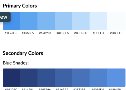
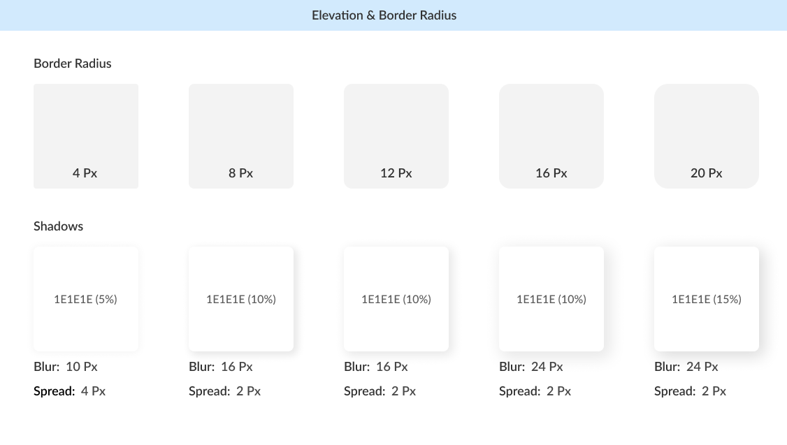
The supplied palette establishes a clear primary-blue progression and a deeper secondary-blue scale; elevation guidance defines corner radii and shadow treatments.
02
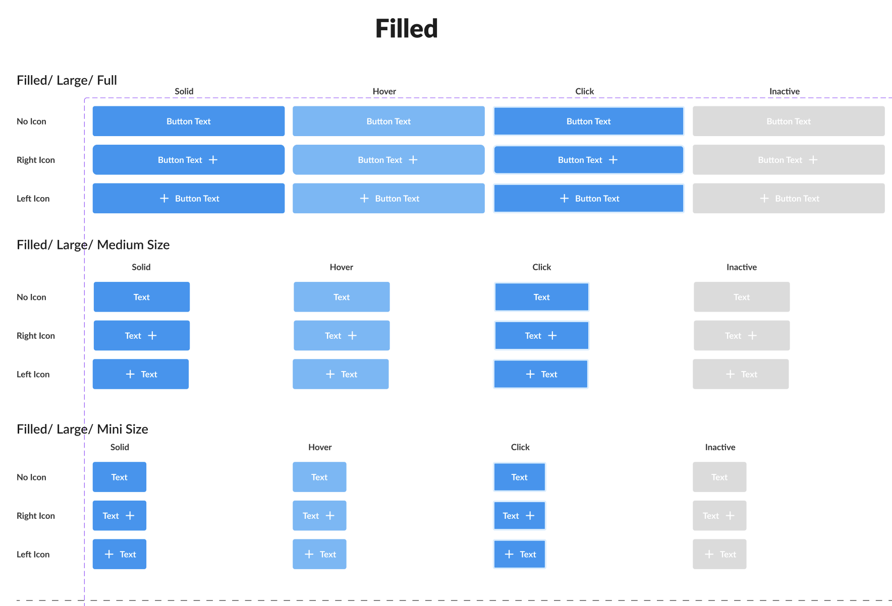
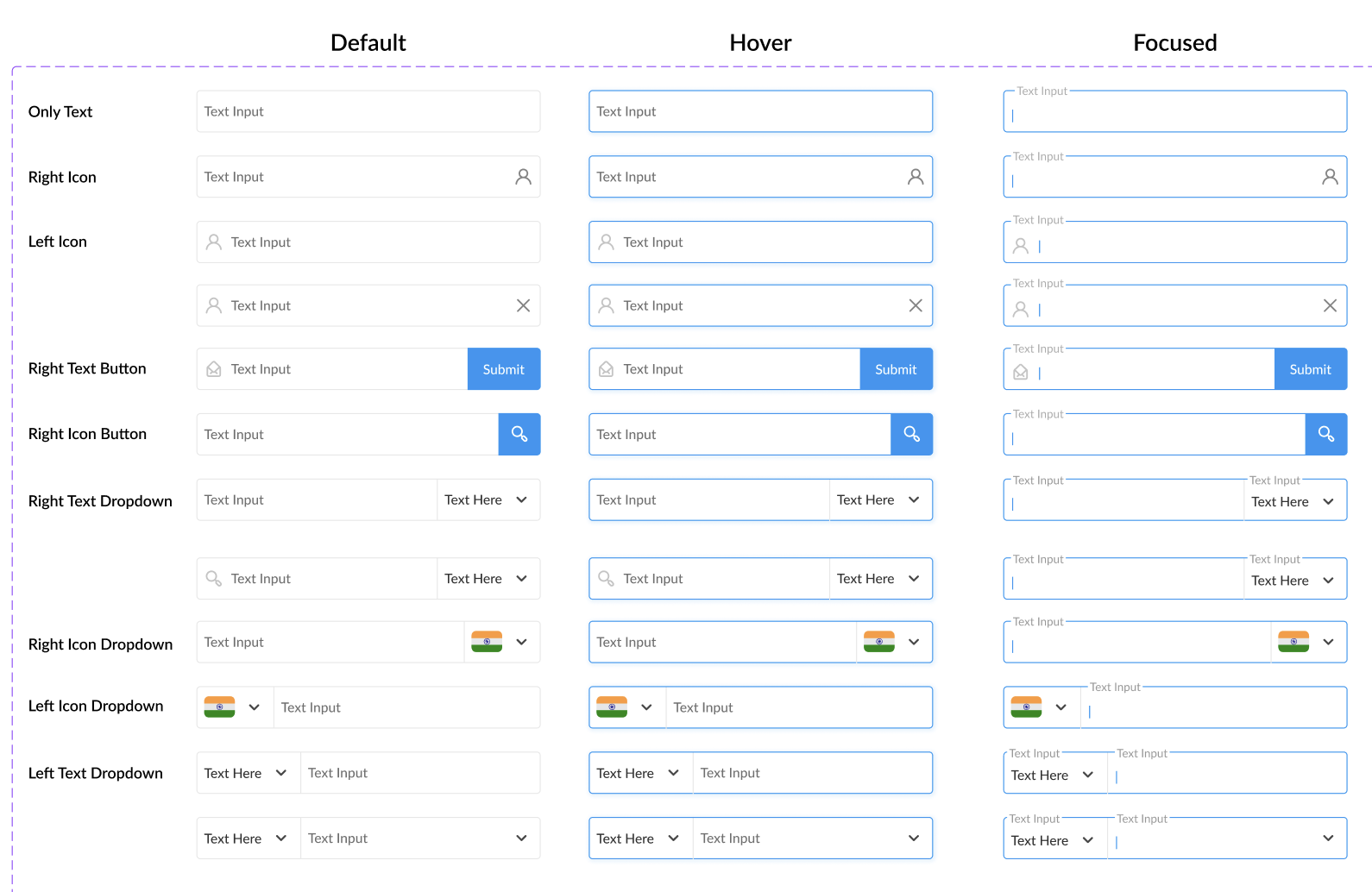
Input and action patterns
Documented interaction states make common controls consistent across product surfaces.
03
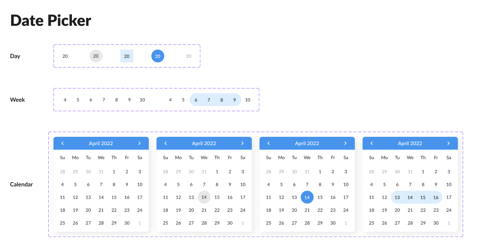
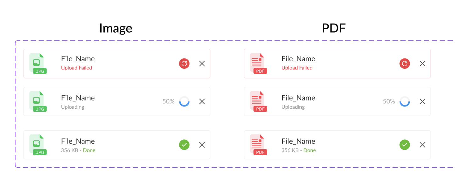
Specialized components
Date selection and file uploads extend the system beyond its basic controls.
04
From system to product
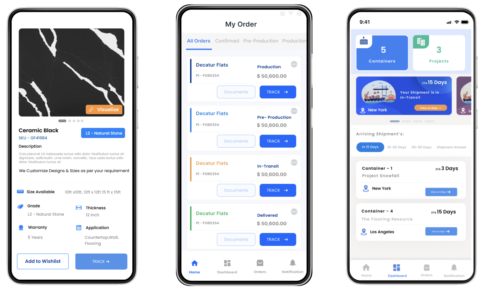
The shared foundations and interaction patterns come together in real mobile workflows, keeping product details, order status and shipment tracking visually consistent.