Global Fair / 2024
Category Manager Dashboard
An action-first command centre for category teams — turning enquiries, payments, seller health and margin into clear daily priorities.
Responsive web · Desktop-first
Category Manager Dashboard
An action-first command centre for category teams — turning enquiries, payments, seller health and margin into clear daily priorities.
Client
Global Fair
Role
Lead Product Designer
Timeline
6 months · 2024
Platform
Responsive web · Desktop-first
Context
Category managers owned a connected chain of decisions: clear ageing enquiries, unblock payments, monitor revenue and margin, and intervene when a seller's delivery quality slipped. The redesigned workspace brings that chain into one role-aware system, moving from portfolio signal to accountable action without another export.
The old workflow split urgent work and performance evidence across tabs and reports. A category manager could see totals but not what needed action first; a category lead could see revenue without the operational reason behind it; seller reviews depended on manually assembled spreadsheets. The brief became: design one decision system for daily triage, leadership review and seller accountability.
Research approach
Understanding the people and workflow behind the brief.
Methods
- Card sorting
- First-click testing
- Task-based interviews
- Eye-tracking pilot
Participants
9 category managers · 4 buyers · 2 supply-chain leads
Duration
5 weeks discovery + biweekly co-design
Research storyboard

Morning handover
Watched managers reconcile overdue enquiries, finance approvals and seller follow-ups before they could assess performance.

Three decision horizons
Mapped immediate queues, category trends and seller evidence as connected layers of one operating rhythm.

Role-aware first reads
Co-designed manager and lead views that share a system while foregrounding different responsibilities.

Confidence, not clicks
Timed whether users could choose an action and explain why, without consulting another report.
Illustrative scenes, not photographs from the original research.
Proposed follow-up survey
A framework for future validation, not reported survey findings: ask about workflow frequency, confidence in the information, the most difficult step, and what would make the task easier.
What emerged
Finding 01
Action before analysis
Users scanned overdue, pending and paid states before any chart. The Action Center therefore leads the page and performance follows it.
Finding 02
One dashboard, distinct responsibilities
Managers and leads shared commercial metrics but needed different shortcuts. Role-aware cards preserved one system without forcing one identical view.
Finding 03
Seller health needs evidence
A composite rating became credible only when users could inspect purchase share, margin, delivery compliance and defects together.
Defining the problem
Problem statement
How might category teams identify urgent work, understand category performance, and review seller health in one connected decision flow?
Design priorities
- Mapped the morning workflow from overdue enquiry to payment approval, then ranked each signal by urgency, financial risk and ownership.
- Designed a role-aware Action Center: category managers see operational queues, while category leads see seller and warehouse coverage alongside commercial performance.
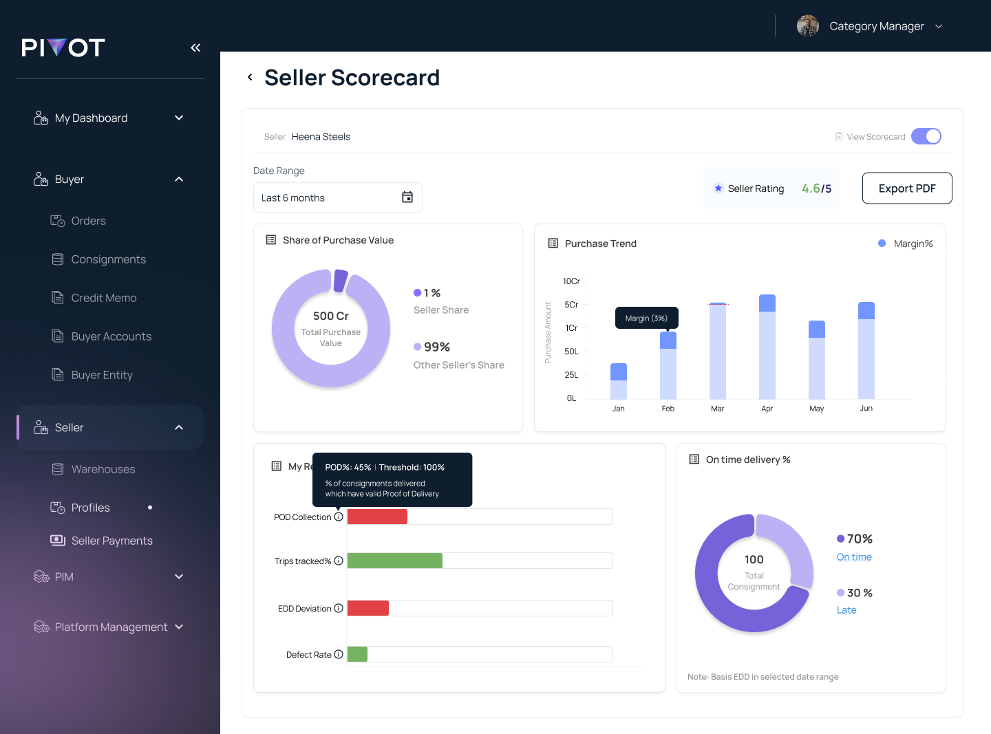
- Connected portfolio-level charts to a seller scorecard spanning purchase share, margin, proof-of-delivery, trip tracking, defects and on-time delivery.
- Validated scan order, filter comprehension and time-to-first-action through six rounds with working category teams.
From research to design
Follow the morning handover
Observed managers move from ageing enquiries to payment approvals, then rebuild category performance and seller health from separate reports.
Contextual observation · Tool-switch inventory · Decision diary
Model three decision horizons
Separated immediate action, monthly category performance and longer-term seller accountability so each answer appears at the right depth.
Jobs-to-be-done · Decision hierarchy · Information priority matrix
Keep roles in one system
Designed shared navigation and filters, then varied the first-read cards for category managers and category leads instead of creating disconnected dashboards.
Role matrix · Information architecture · Permission states
Link every chart to a decision
Tested compact status cards, target rings and sub-category comparisons; removed metrics that could not trigger a follow-up action.
Wireframes · Data-viz studies · Co-design critique
Measure time to confident action
Six rounds tested whether users could identify the next task, explain category variance and assess a seller without opening another report.
First-click testing · Scenario tasks · Time-to-insight benchmark
Low-fidelity exploration · schematic reconstruction
Structure before visual design
These simplified layouts illustrate the information hierarchy and task sequence; they are not original research artifacts.
Testing & evidence
Design decisions were reviewed against the research themes and the workflow priorities above. Further measurement is needed to establish a reliable before-and-after comparison.
Outcome
The final interface
Three connected views show how a category team moves from urgent work, to portfolio performance, to evidence-based seller review.
01
Start with the work that cannot wait.
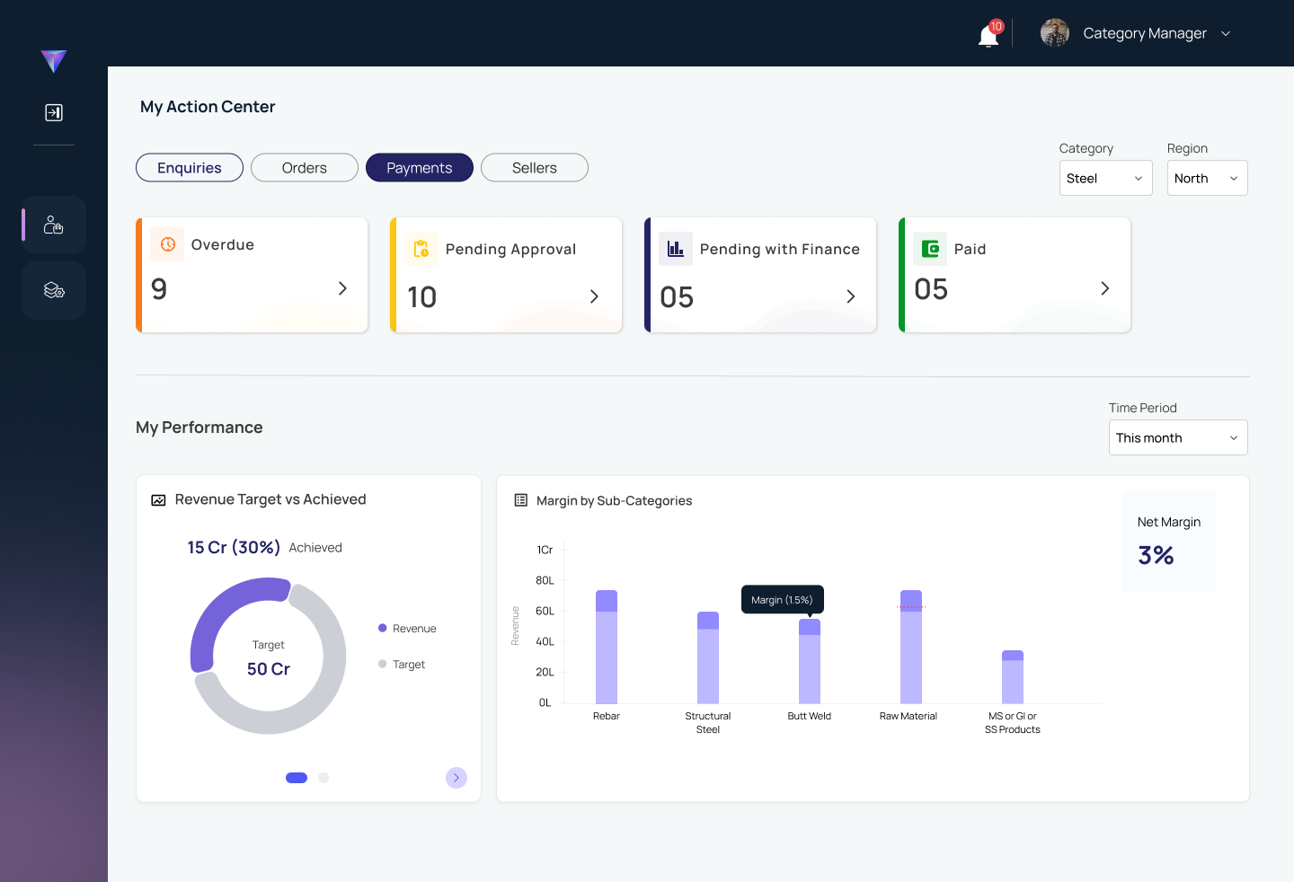
The Action Center makes operational state the first read. Enquiry, order, payment and seller tabs preserve one mental model; urgency cards expose overdue work and approval bottlenecks before performance charts add context.
02
Give category leads the wider operating picture.
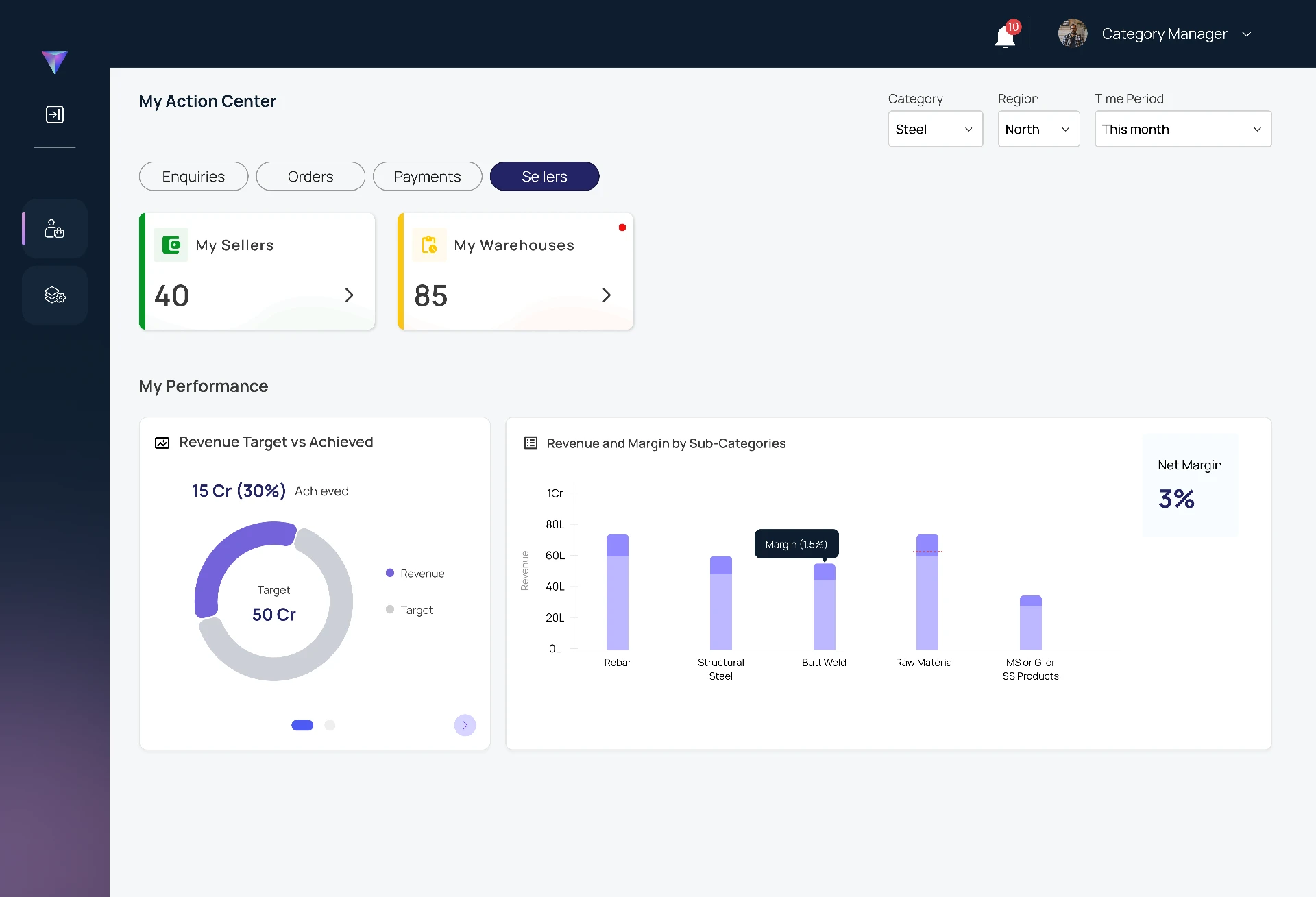
The lead view shifts the first row from transaction queues to capacity: active sellers and warehouses. Shared filters and consistent charts let leaders compare category performance without relearning the interface.
03
Turn seller reviews into evidence.
The scorecard carries the manager from portfolio signal to one seller's operating record. Purchase share, monthly margin, proof-of-delivery, tracked trips, defects and on-time delivery sit in one exportable review surface.