Global Fair / 2023
Buyer App — Globalfair
A native-feel cross-border buyer experience for a US-based building-materials marketplace.
iOS · Android · Native
Buyer App — Globalfair
A native-feel cross-border buyer experience for a US-based building-materials marketplace.
Client
Global Fair
Role
Lead Product Designer
Timeline
7 months · 2023
Platform
iOS · Android · Native
Context
Cross-border procurement is paperwork dressed up as commerce. The buyer app strips that down to a flow that feels like ordering coffee — and quietly handles tariffs, lead times, and freight under the hood.
US buyers wanted Indian manufacturing without the complexity. The old web flow had 14 steps, three logins, and a PDF. We needed mobile-first, single-thread, no surprises.
Research approach
Understanding the people and workflow behind the brief.
Methods
- Remote interviews (US buyers)
- Journey mapping
- Prototype testing on-site
- Field visits to warehouses
Participants
11 US procurement buyers · 4 warehouse managers · 3 freight partners
Duration
4 weeks discovery + 3 rounds of prototype testing
Research storyboard

On-site with buyers
Observed procurement work happening in warehouses, not at a desk.

Trust before price
Buyers explained they need supplier proof long before they compare numbers.

Native-first flows
Separate iOS and Android sketches so neither inherited the other's patterns.

Test where Wi-Fi fails
Prototype rounds run on-site, including deliberate offline scenarios.
Illustrative scenes, not photographs from the original research.
Proposed follow-up survey
A framework for future validation, not reported survey findings: ask about workflow frequency, confidence in the information, the most difficult step, and what would make the task easier.
What emerged
Finding 01
Buyers price in trust
Every hidden fee killed a returning order. Transparent totals were table-stakes.
Finding 02
Offline-first isn't optional
Any friction at scan-time got the app deleted. Queue-and-sync saved retention.
Finding 03
Four steps is the ceiling
Above four form steps, completion collapsed. We rebuilt to fit under it.
Defining the problem
Problem statement
How might US buyers place and track cross-border orders on mobile without navigating fragmented steps, unclear costs, or missed updates?
Design priorities
- Mapped the buyer's decision moments — not the company's process — and designed around those.
- Hid complexity in defaults: smart freight, smart tariffs, smart timelines, all overridable.
- Designed an offline-first state model for spotty warehouse Wi-Fi.
- Native components only, no cross-platform shortcuts — it had to feel local on both OSes.
From research to design
Follow the buyer, not the process
Interviews with US procurement leads and warehouse visits to see where connectivity and patience actually break.
Remote interviews · Field visits · Journey mapping
Four steps is the ceiling
Quantified drop-off across the legacy 14-step flow and set a hard structural constraint for the redesign.
Funnel analysis · Design constraints · Problem framing
Hide complexity in defaults
Modelled freight, tariffs and lead times as smart, overridable defaults instead of user-facing forms.
Task flows · Default logic model · Offline state model
Native-first sketches
Separate iOS and Android explorations so neither platform inherited the other's conventions.
Wireframes · Platform pattern study · Interaction sketches
Test where the Wi-Fi fails
Three prototype rounds run on-site in warehouses, including deliberate offline scenarios.
On-site prototype testing · Offline scenario tests · Completion metrics
Low-fidelity exploration · schematic reconstruction
Structure before visual design
These simplified layouts illustrate the information hierarchy and task sequence; they are not original research artifacts.
Testing & evidence
Design decisions were reviewed against the research themes and the workflow priorities above. Further measurement is needed to establish a reliable before-and-after comparison.
Outcome
The final interface
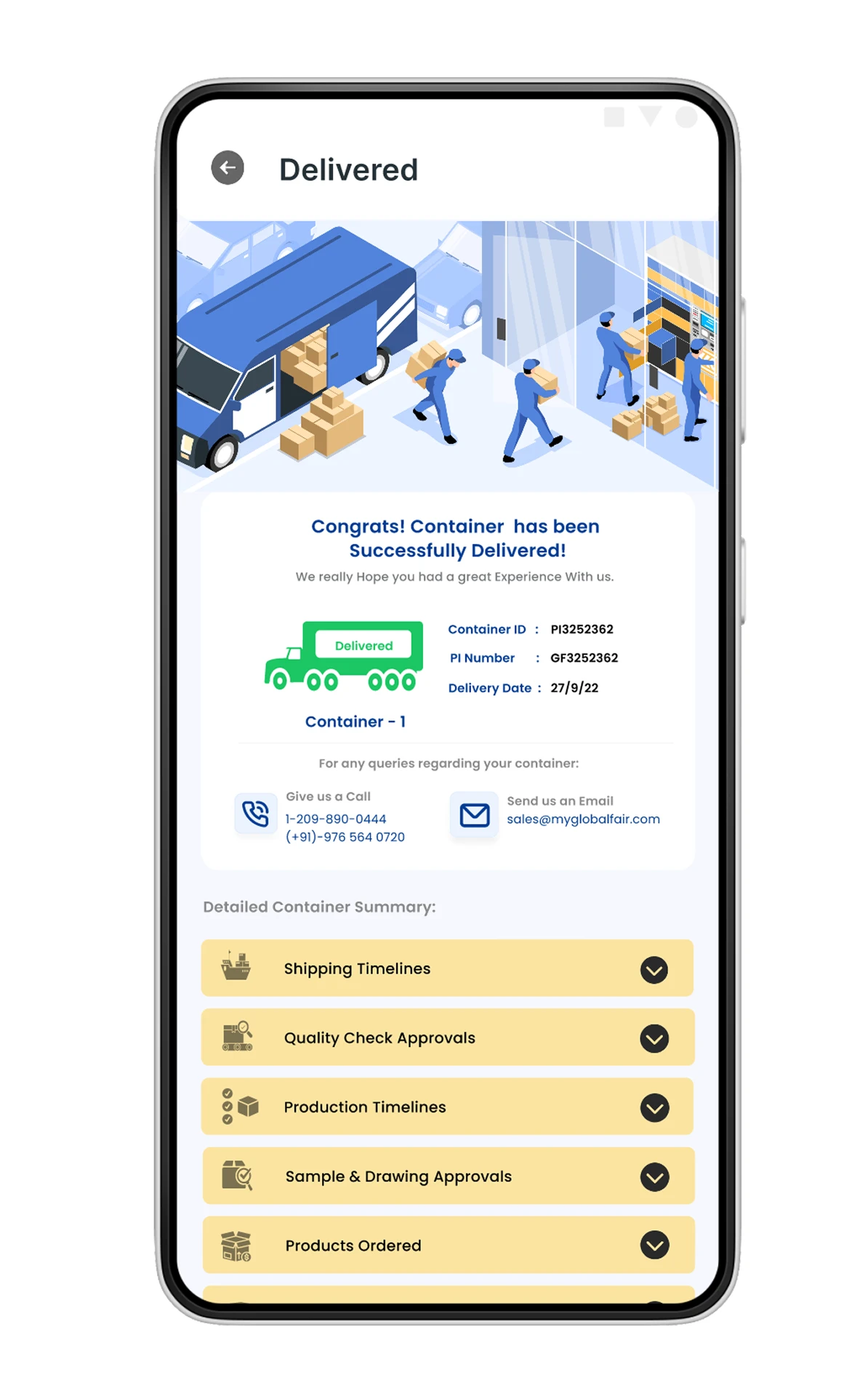
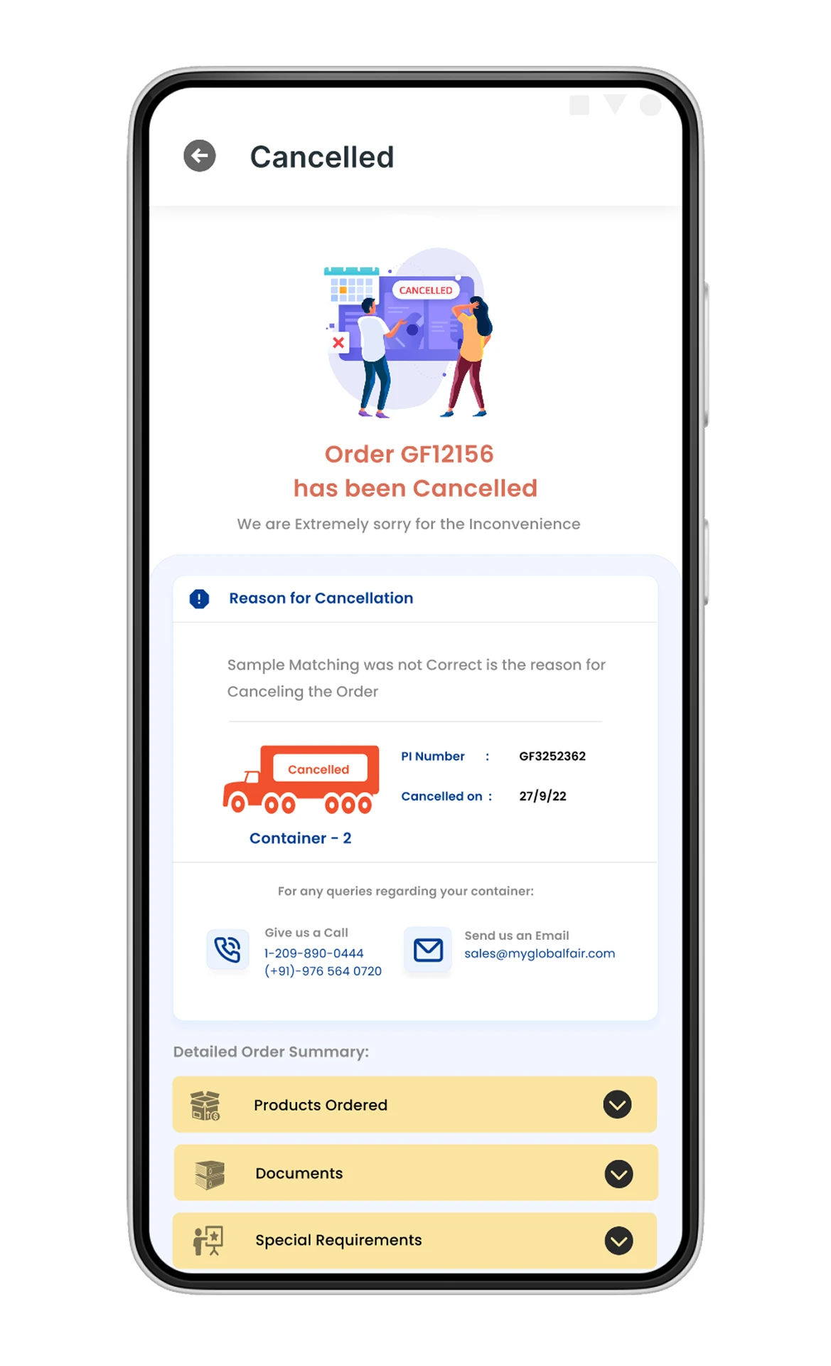
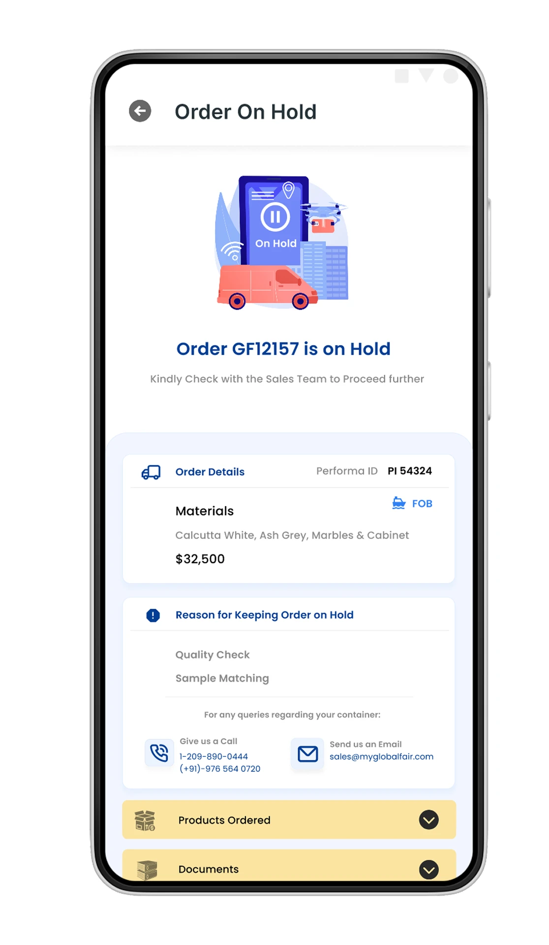
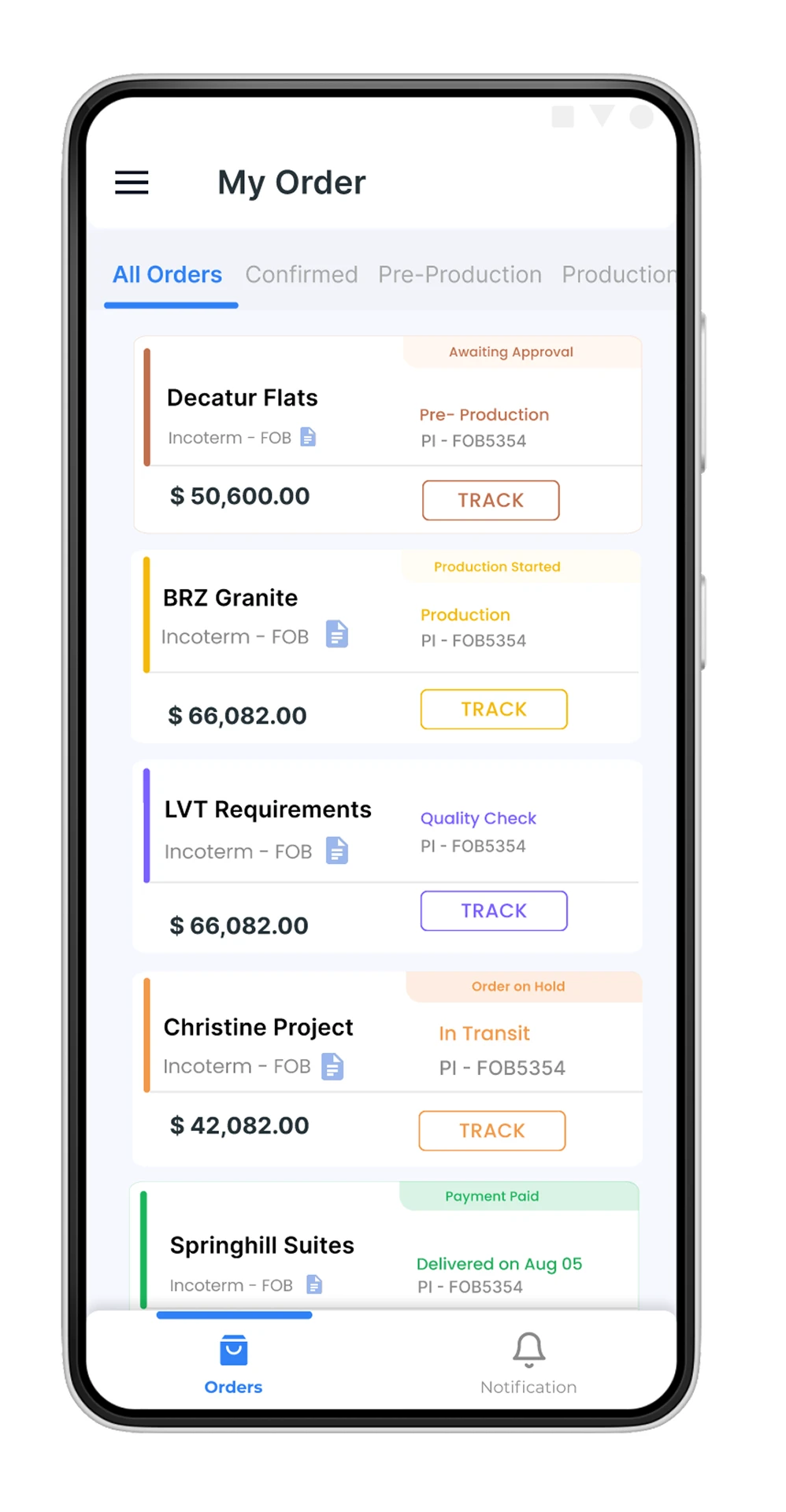
A closer look at the product screens and the decisions they support.
01
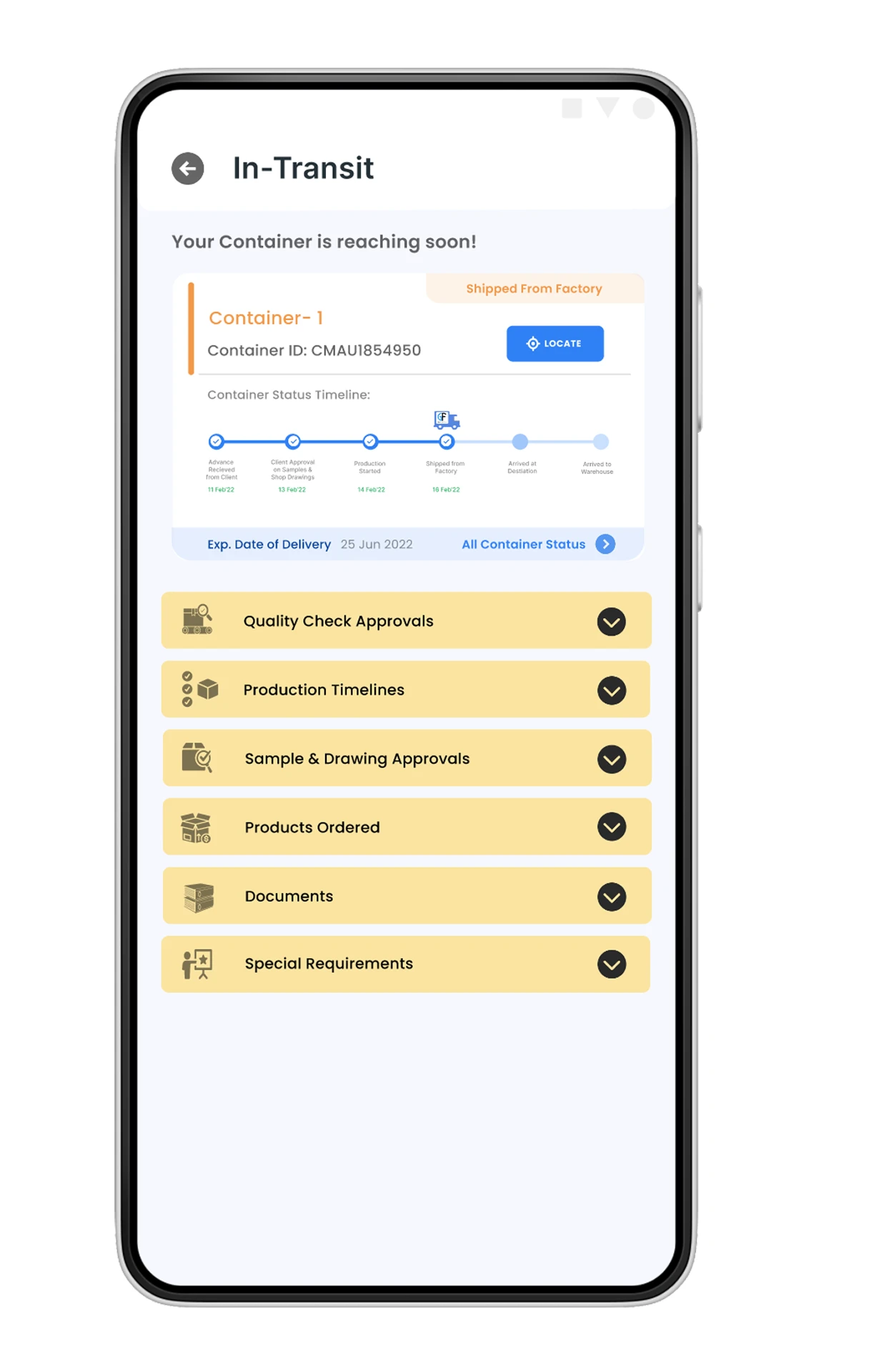
Order visibility.
One list that answers the only question buyers actually ask: where is my order right now?
02
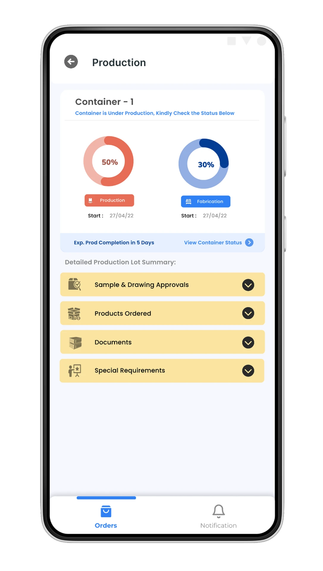
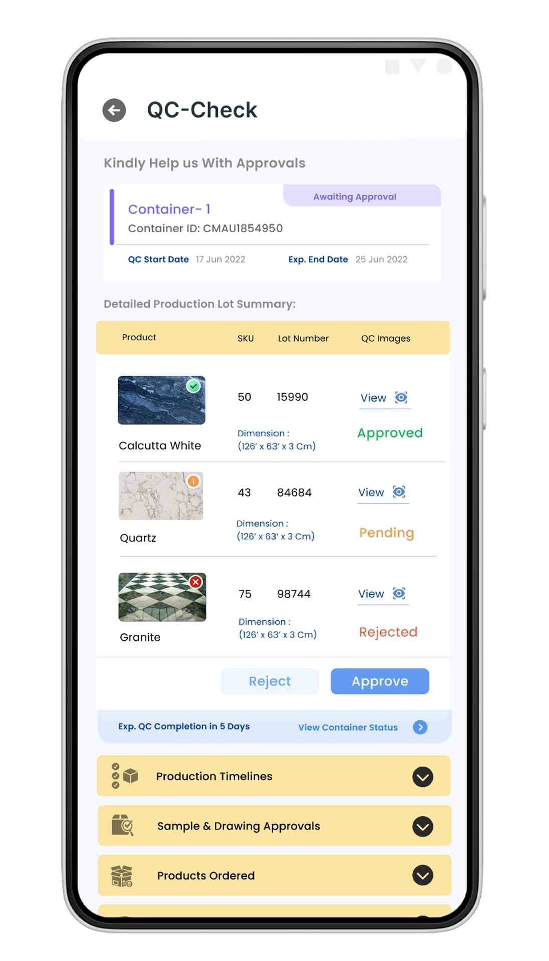
Production & quality.
Approvals moved from email threads into the app, with lot-level evidence attached.
03
Exceptions & closure.
Every unhappy path gets a clear reason, a contact route, and a way forward.