Atlas — a shared language for complicated products.
From foundations to components, from components to patterns. A story about turning repeated UI decisions into a system that leaves room for the work each product needs to do.
Client — Aditya Birla PivotFoundations → Components → PatternsWeb & mobileExplore the story ↓
Leadership
Atlas is a design system built to support a rapidly growing B2B platform operating across multiple business domains — procurement, sales, credit, order management, and logistics.
ProcurementSalesCreditOrder managementLogistics
01 / The starting point
One product grows. So do its decisions.
Procurement screens, credit dashboards and enquiry flows serve different needs. Atlas explores what they can share: a consistent vocabulary for hierarchy, interaction and feedback, without forcing every workflow into the same layout.
Client — Aditya Birla Pivot.
This story pairs the implemented portfolio system with your supplied reference screenshots and recordings. Reference material is preserved as supplied; it does not establish team ownership, research execution or measured business outcomes.
02 / The principles
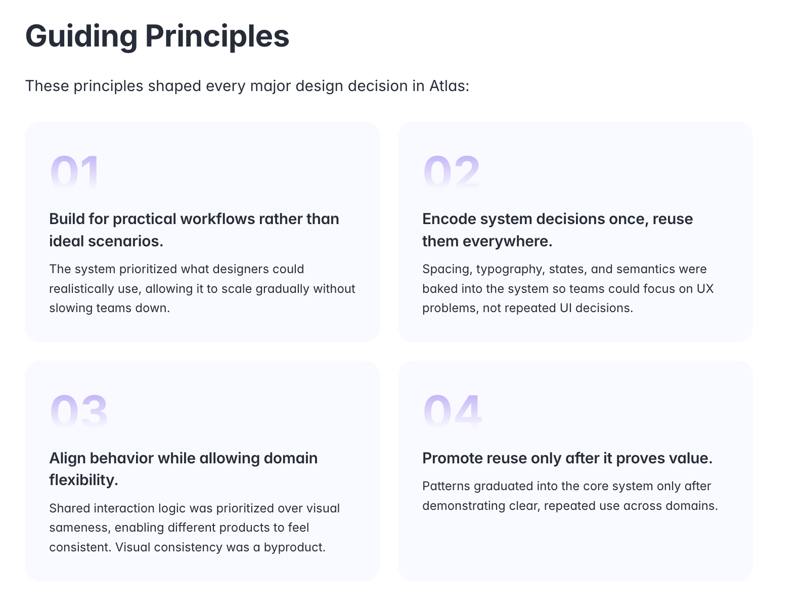
Practical first. Shared where it matters.
01
Build for real workflows, not ideal scenarios.
02
Make repeated decisions once, then reuse them.
03
Align behaviour while leaving room for domain needs.
04
Promote patterns after repeated value is clear.
Supplied guiding-principles reference.
03 / Building & scaling
From scattered decisions to a system.
Phase 01
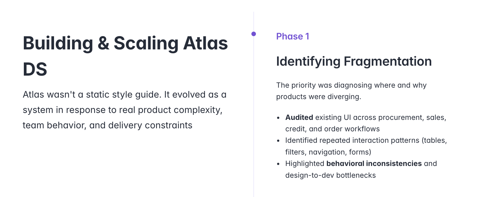
Discover the repetition
First, find the fragmentation.
Before adding more components, identify where the same task behaves differently. The supplied story starts with procurement, sales, credit and order workflows: repeated tables, filters, navigation and forms become the starting point for a shared language.
Supplied phase 1 reference · identifying fragmentation across product workflows.
Phase 02
Establish the language
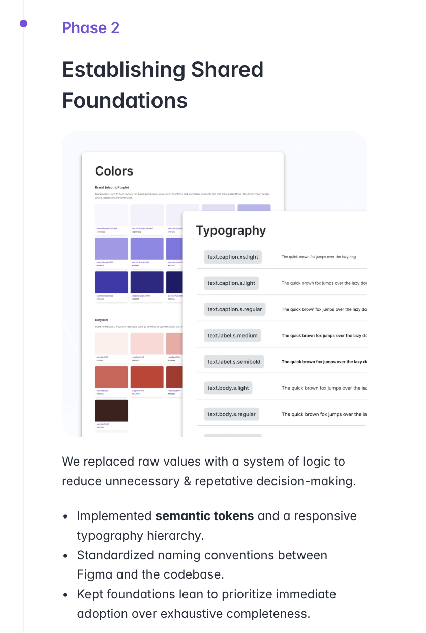
Give repeated decisions a shared foundation.
The next layer is a vocabulary, not just a palette. Semantic tokens describe the purpose of a value; typography and spacing establish hierarchy. In this portfolio, Atlas applies that separation so the same components can follow the active theme.
Supplied phase 2 reference · shared foundations and naming conventions.
Phase 03
Define the behaviour
Turn foundations into component contracts.
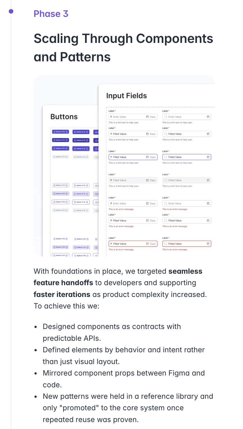
A button is more than its resting appearance. Intent, size, state and optional content describe how it behaves. The supplied component examples bring these variations together, while a reference library gives new patterns room to develop before becoming shared defaults.
Supplied phase 3 reference · button and input variations.Component highlights · buttons, tables and feedback states · Silent screen recording.
Phase 04
Maintain the system
Keep the system useful as it grows.
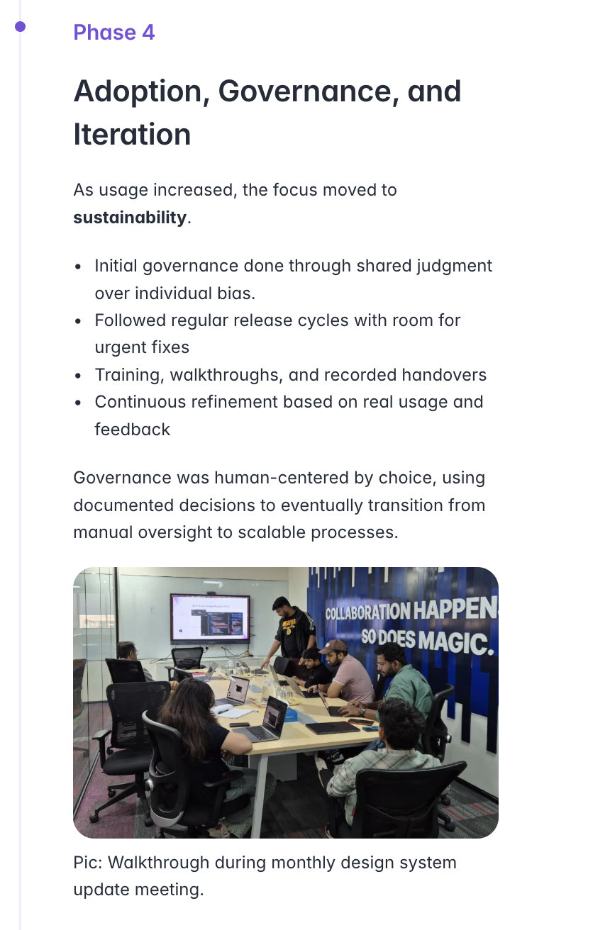
A library needs a way to evolve. The supplied governance material describes shared review, release cycles, walkthroughs and feedback. These are the operating principles for sustainable adoption—not a measured claim about this portfolio’s rollout.
Supplied phase 4 reference · adoption, governance and iteration; meeting photograph shown within the supplied source.
04 / Connecting design & delivery
The same vocabulary, on both sides.
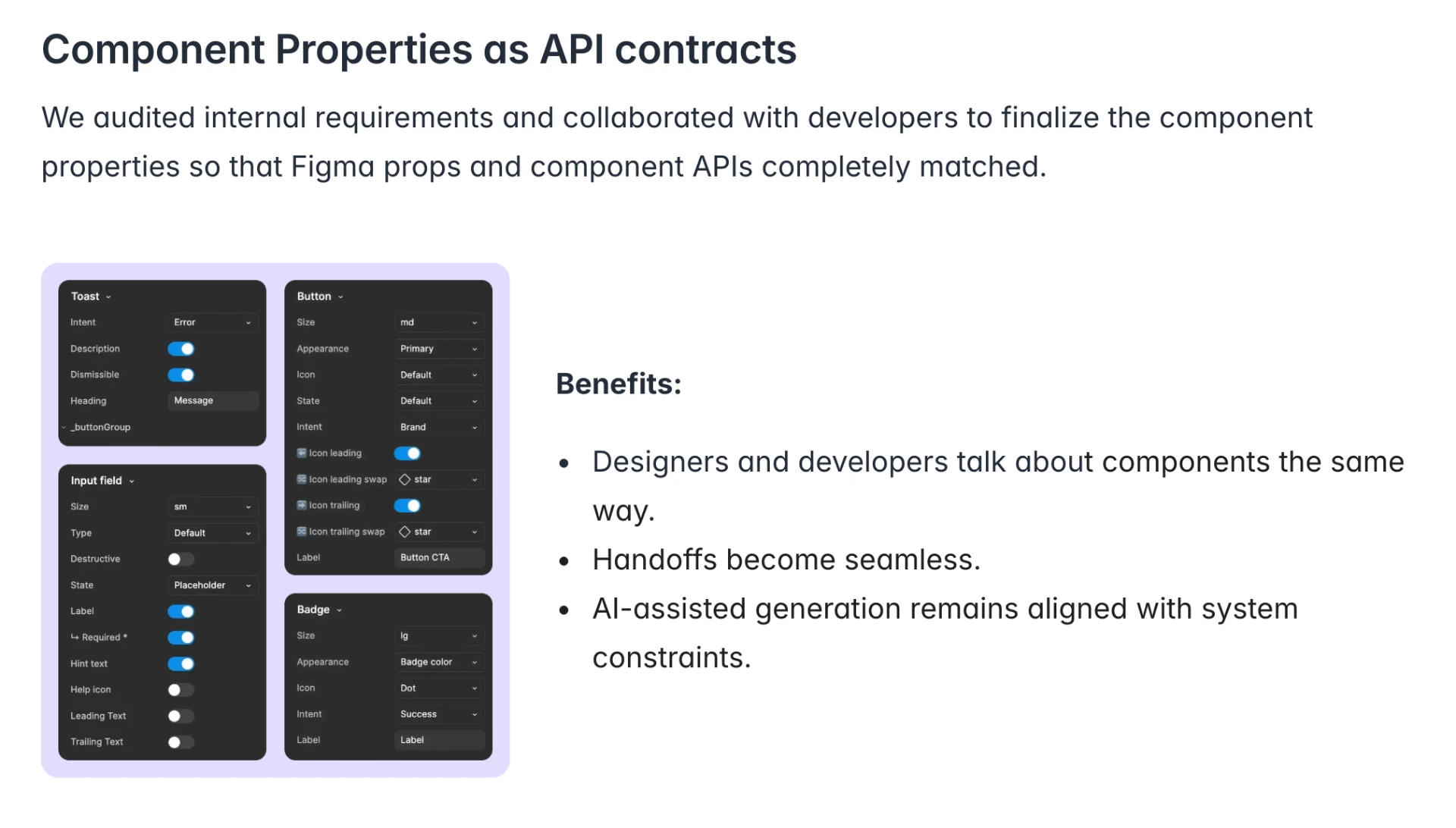
The supplied property panels make the contract tangible: intent, size, appearance, state and optional icons. Documentation then adds context—when to use a pattern, how it responds and what stays consistent across platforms.
Consistency is a shared decision—not identical screens.
Atlas is implemented here as a token and documentation layer. The supplied material illustrates how that thinking can extend into enterprise components, team practices and product flows. The production screens below show the domain context; no adoption figures or delivery improvements are claimed without supporting evidence.
Explore the Atlas token & component reference
The implemented foundations behind this portfolio.
01
Color · primitives
Six ramps, eleven stops each. The brand base is copper #c97f52 at stop 500. Sister hues keep copper's saturation and lightness and shift hue only, so every ramp shares relative luminosity. Primitives are never used directly in components.
Copper · brand --atlas-copper-50…950
50
100
200
300
400
500
600
700
800
900
950
Neutral --atlas-neutral-50…950
50
100
200
300
400
500
600
700
800
900
950
Red --atlas-red-50…950
50
100
200
300
400
500
600
700
800
900
950
Green --atlas-green-50…950
50
100
200
300
400
500
600
700
800
900
950
Amber --atlas-amber-50…950
50
100
200
300
400
500
600
700
800
900
950
Blue --atlas-blue-50…950
50
100
200
300
400
500
600
700
800
900
950
02
Color · semantic roles
The only colors components may reference. Each role aliases the active theme, so the four palettes re-skin every component without a single semantic name changing.
Background
page canvas
--atlas-bg
Surface
cards, raised blocks
--atlas-surface
Fill
quiet fills, hover wash
--atlas-fill
Text / primary
headings, body emphasis
--atlas-text-primary
Text / secondary
captions, metadata
--atlas-text-secondary
Text / inverse
on ink buttons
--atlas-text-inverse
Stroke / default
hairlines, card borders
--atlas-stroke-default
Stroke / strong
hover borders
--atlas-stroke-strong
Interactive
links, accents, focus
--atlas-interactive
Success
positive feedback
--atlas-success
Warning
caution feedback
--atlas-warning
Error
destructive feedback
--atlas-error
Info
neutral feedback
--atlas-info
03
Typography
Six roles on a ×1.25 modular scale over a 4px base. Display and Heading step up automatically at the desktop breakpoint — consumers never set sizes manually.
Display
Urbanist · 40/64px · 600 · -0.03em
atlas-display
Complicated products, made calm.
Heading
Urbanist · 32/44px · 600 · -0.02em
atlas-heading
The tools I think in.
Title
Urbanist · 20px · 600 · -0.01em
atlas-title
Danske Bank Research Hub
Body
Epilogue · 16px · 400 · 1.65
atlas-body
For 7+ years I've turned procurement, banking, trading and B2B workflows into interfaces people finish tasks in without a manual.
Label
Epilogue · 13px · 600 · 0.01em
atlas-label
View case studies
Caption
Epilogue · 12px · 500 · 0.02em
atlas-caption
Conceptual illustrations, not product screenshots.
04
Spacing, radius & elevation
Spacing · 4px base
space-1
space-2
space-3
space-4
space-6
space-8
space-12
space-16
Radius
radius-sm
radius-md
radius-lg
Elevation
elevation-1
elevation-2
elevation-3
05
Components as contracts
Components are defined by intent, consume semantic tokens only, and ship their hover, focus, active and disabled states built in — consumers never style states manually. Focus rings are always visible; contrast meets WCAG AA.
Buttons
atlas-btn · atlas-btn-primary / -accent / -ghost
Badges
Default ShippedIn progressResearch
atlas-badge
Cards
Resting
Surface, hairline stroke, elevation-1.
Raised
Elevation-2 for hovered or active surfaces.
Featured
Elevation-3, the premium shadow, for hero surfaces.
atlas-card
06
Patterns
Editorial reading column
Long-form content sits in a measured 740px column inside a 1060px container — the case-study rhythm.
Copper-italic emphasis
One italic accent word per headline, in the interactive color. Never more than one.
Instant on mobile
Scroll-reveal motion is desktop-only; on phones every element renders immediately.
Theme-safe by construction
Because components only touch semantic tokens, all four palettes — light and dark — just work.
07
Component architecture
Following Brad Frost's Atomic Design, Atlas components are organised into five intent groups.
ActionsInputsFeedbackStatusNavigation
Properties as API contracts
Design props and code props carry the same names and values, so a component is described the same way in the design file and in the codebase.
AI-assisted generation stays inside system constraints.
Component management
The library stays curated, not a catch-all. New organisms live locally in their feature until they earn a place by meeting all three criteria:
01
Proven reuse
Used across more than one domain, not a one-off.
02
Consistency is critical
Brand or experience breaks if it drifts.
03
Clear value
It removes repeated decisions or build effort across teams.
08
Pattern governance
Repeating user intents become patterns. The objective: standardise system logic and response everywhere, while layout and data density stay context-specific.
Drawer
Side sheet on desktop, bottom sheet on mobile — same hierarchy, actions and dismissal rules.
Card
One structure for summary, metadata and actions; density adapts to the surface it sits on.
Platform & domain variance
Patterns start as local solutions and graduate only after cross-domain reuse.
Intent and behaviour stay stable while UI changes across desktop, mobile and app.
Structural variants share the same hierarchy, actions and rules.
Each pattern is documented with intent, usage and behavioural rules.
06 / The final screens
Different workflows. A familiar language.
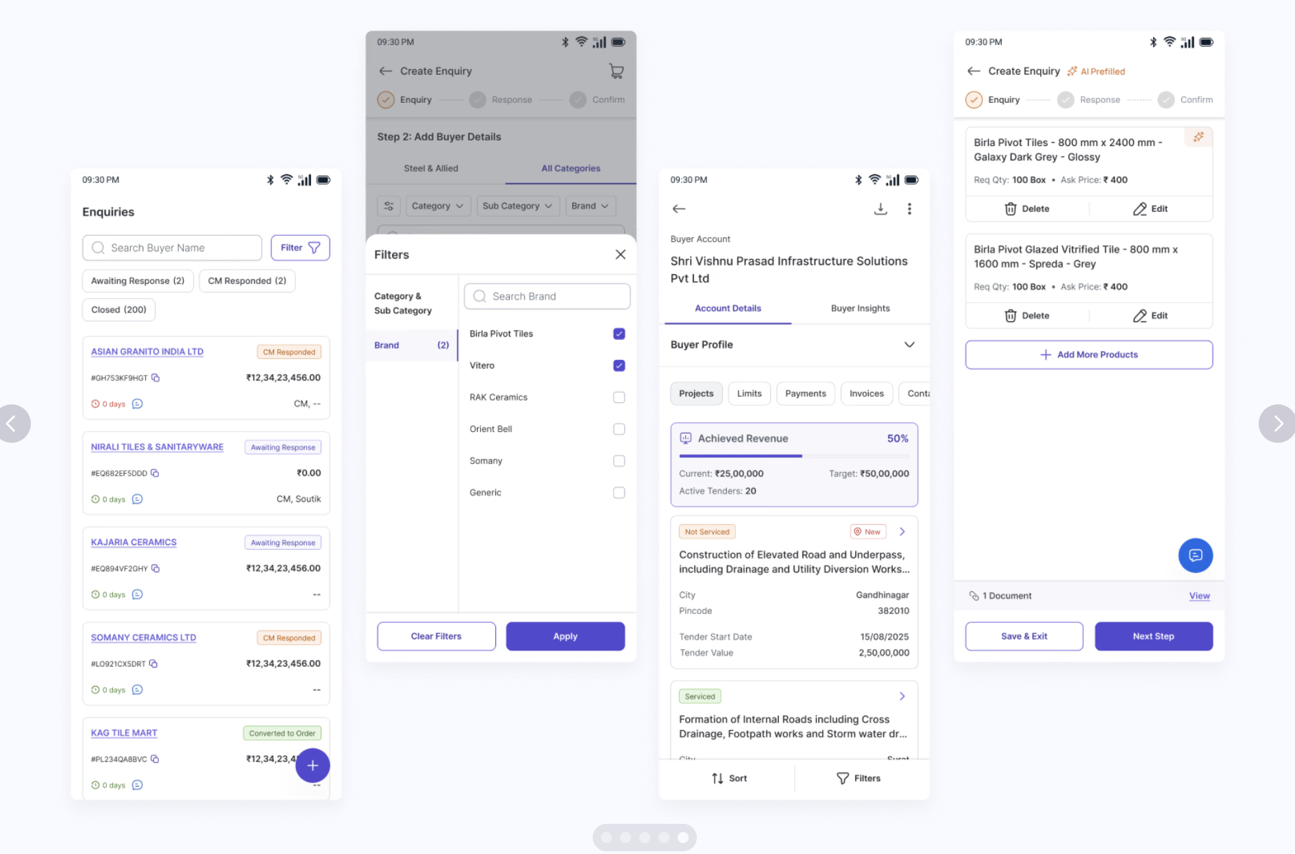
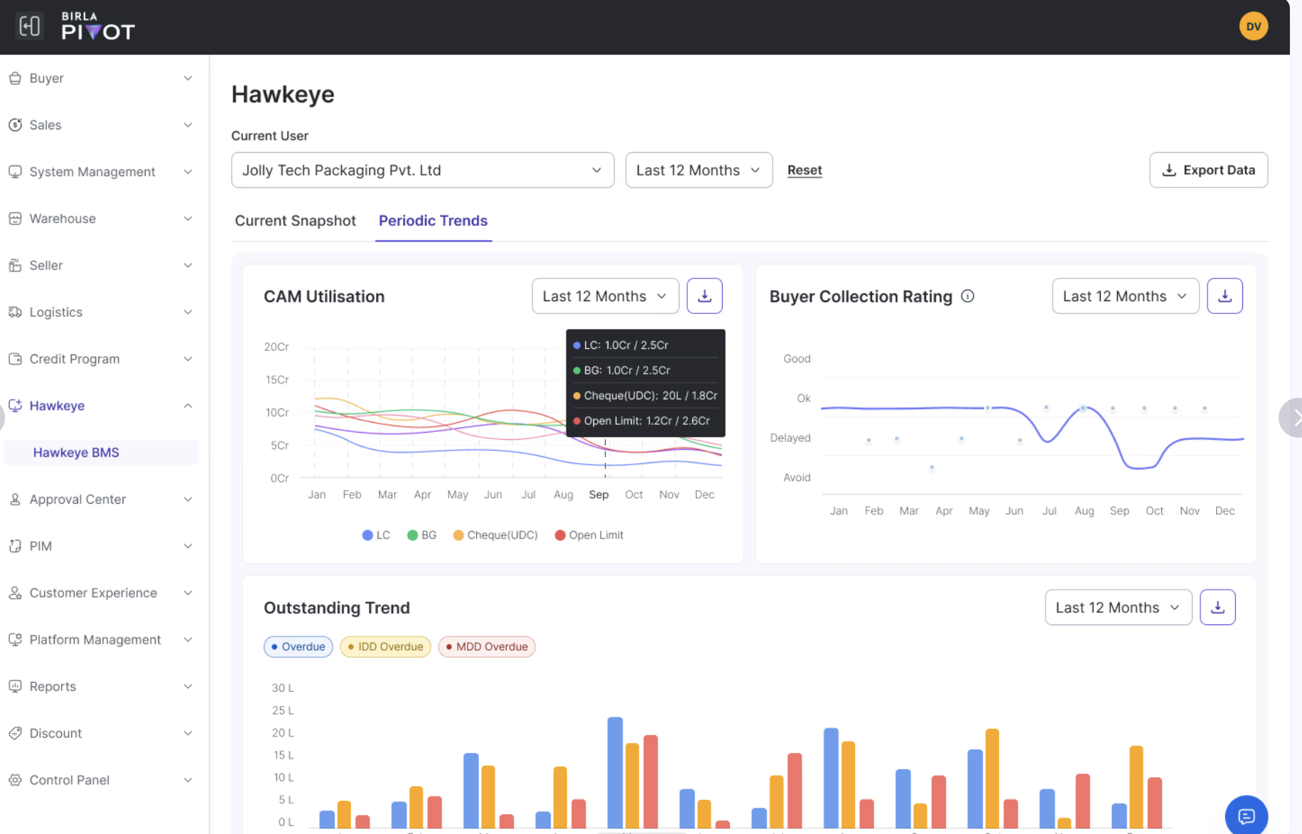
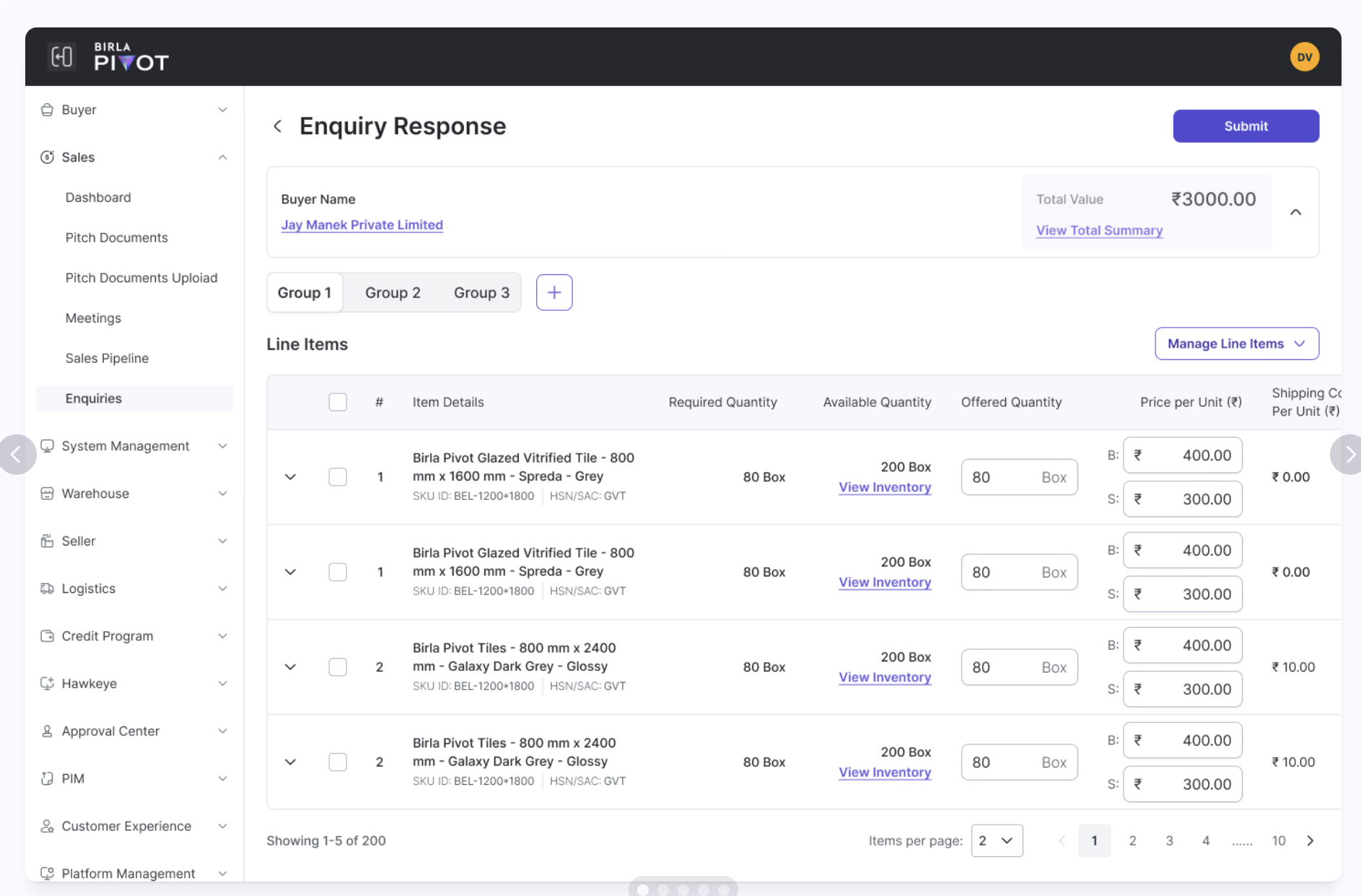
Selected supplied Birla Pivot screens bring the story back to the product: mobile enquiry flows, credit-monitoring dashboards and detailed enquiry responses. They illustrate the kinds of tables, drawers and forms a shared system needs to support, with Birla Pivot’s own branding.
Mobile · enquiry list, filter drawer, buyer account and AI-prefilled create-enquiry flow.Desktop · Hawkeye credit-monitoring dashboard with periodic trends.Desktop · enquiry response with grouped line items.